03 of 05 · Insurebest quote journey
High-Value Coverage
Helping renters recognize what they own before asking them to decide how to protect it.
The context
People were asked an insurance question they had no way to answer
Somewhere in the middle of a renters quote, people run into a decision they never really think about in insurance terms. The screen asks whether they need extra coverage for high-value items. What is actually going through their head is simpler and more human: does my ring count? Is my camera expensive enough? What happens if my laptop gets stolen? Do I even own anything worth adding?
The business had a clear reason to ask. Basic renters insurance caps or excludes categories like jewelry, collectibles, and fine art, and the business wanted to identify people who owned those things and connect them with an agent who could schedule proper coverage. The trouble was the question itself. It spoke the language of policies, when people only speak the language of their own stuff.
The problem
Business problem
The business needed to identify renters with high-value items that fall outside the base policy, and route them to an agent who could itemize and schedule that coverage properly.
Customer problem
People were asked to size up their own belongings in a vocabulary they do not use. With nothing to anchor to, the honest answer to "do you need extra coverage?" was a shrug.
UX problem
The flow led with a coverage decision before giving anyone a chance to recognize themselves in it. It asked people to know the answer before it helped them understand the question.
My role
Lead designer. I ran the discovery, facilitated the ideation sessions, and owned the flow from concept through testing and handoff. I worked closely with a personal lines subject-matter expert to learn which categories genuinely require itemization, with content on the language, and with design management on direction. The question I kept coming back to was a simple one: how do you ask people about their valuables without making them feel quizzed?
The reframe
Recognition first, insurance terms later
The shift was to stop leading with a coverage decision and start with recognition. People do not recognize "scheduled personal property" or "valuable articles endorsement." They recognize their Rolex, their engagement ring, their camera. So the flow was rebuilt to move in the order a person actually thinks: do I own something valuable, then what is it worth, then how should it be protected.
That is progressive disclosure doing real work. Coverage limits and policy language stay out of sight until the customer has established relevance for themselves. And it is the same pattern running through my other work on this quote: insurance keeps asking customers to make expert decisions, and the design turns each one into a guided human decision. Quote Customization did it for price and coverage. Agent Awareness did it for expert help. This did it for what you own.
Exploration
How much itemization is the right amount
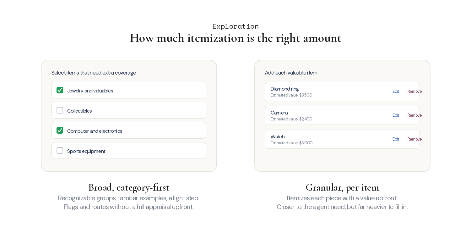
The central fork in exploration was how granular to make the itemization. A broad version grouped belongings into recognizable categories and kept the step light. A granular version asked people to itemize individual pieces with values, closer to what an agent eventually needs, but far heavier in the moment.
Weighing the two came down to the subject-matter reality: not every valuable needs an itemized entry up front, and the front-end step exists to flag and route, not to complete the appraisal. That pointed toward the broad, category-first direction, with the detailed itemization handled later, with an agent.
What testing surfaced
People understood the page, then wanted a price the flow could not give
Testing with ten participants confirmed the recognition approach was working, and surfaced one telling tension.
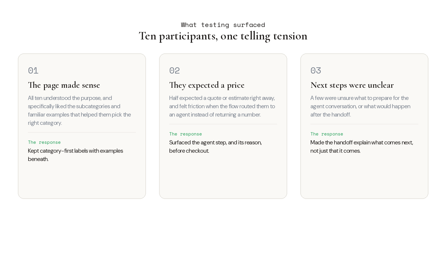
All ten understood the purpose of the page, and they specifically liked the subcategories and familiar examples, which helped them pick the right category with confidence. The surprising part was about price. Half the participants expected to see a quote or estimate immediately, and felt friction when the flow routed them to an agent instead of returning a number. A few were also unsure what to prepare for that agent conversation. That friction was not something to hide. It is exactly what the transparent handoff was built to answer: surfacing the agent step, and the reason for it, before checkout rather than after.
The solution
Self-qualify, recognize, then a handoff that explains itself
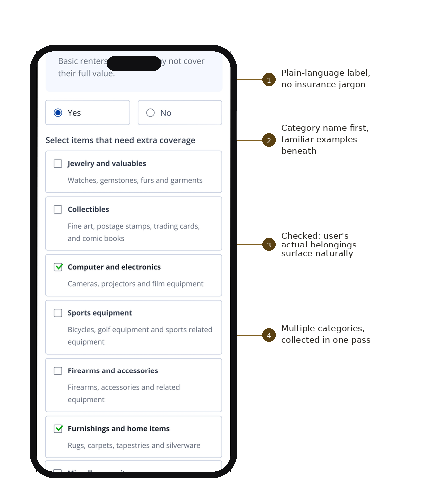
The flow opens with a single self-qualifying question, does this even apply to you, before asking anyone for details. A renter with nothing to declare finishes the quote online and never sees the itemization step. For those who do have valuables, the checklist does the quiet work: plain-language labels instead of policy jargon, category names first with familiar examples beneath, so people recognize what they own before deciding what to protect.
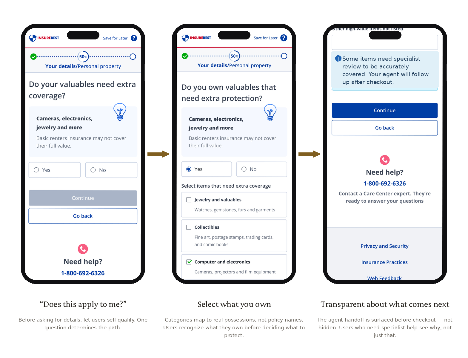
The checklist itself is built for recognition. Category names lead, familiar examples sit beneath, and checking a box surfaces the person's actual belongings rather than asking them to parse coverage terms. Then the agent handoff is stated before checkout, with the reason for it shown, so anyone who needs specialist help sees why, not just that. That is the direct response to the testing friction, and the difference between a trusted layer and a bait-and-switch.
Results
Validation through usability testing
Asked to describe the experience in a word, three in four landed on neutral, dependable terms like professional, clear, and familiar, roughly a quarter chose positive ones like modern and fresh, and only a small fraction found it complicated. For a legal, coverage-heavy step, reading as clear and familiar rather than intimidating is the win.
For users
People recognize what they own in their own words, understand why it matters, and know what happens next instead of being surprised by an agent handoff.
For business
The right renters get flagged for itemization and routed to agents better prepared for the conversation, without forcing friction on the people it does not apply to.
Reflection
Insurance keeps asking customers to make expert decisions. The work here, like the rest of this quote, was turning one of those into a guided human decision. Not "do you need a valuable articles endorsement," but "does your ring count?" People already know what they own. The design just had to meet them in their own words.