04 of 05 · Insurebest quote journey
Driver History
Turning a business-driven legal disclosure into something that feels useful to the person filling it out.
The context
A driving record quietly shapes the price, and no one could see it happening
When someone shops for insurance, a third-party system checks their driving history to validate what they entered, and that check directly shapes the final quote. The old experience gave people no window into any of it. No explanation, no context, no moment of understanding.
The business came to UX with a clear ask: surface accident and ticket capture on the front end, so customers could see what was going into their price. The reasoning was practical. Insurance is expensive enough in some regions that transparency at the right moment builds trust. This started as a request to add a step to the quote, right between adding drivers and adding vehicles, not as a redesign of something that already existed. My job was making that added step feel genuinely useful, not punitive.
The problem
Business problem
The business wanted digital capture of accidents and tickets on the front end. But the backend was tied to third-party validation, which limited what the frontend could do.
Customer problem
People had no visibility into how their history affected their final price. The validation happened invisibly and could shift the quote, which eroded trust at a sensitive moment.
UX problem
The quote flow was already dense and product did not want a new page. Content design resources were unstable throughout. Everything had to fit inside the existing flow without adding steps or cognitive load.
My role
UX lead. Before sketching anything, I mapped the backend logic to understand exactly what the system was doing and where it could create problems for people. From there I led a cross-functional kickoff with product, research, UX, and content to align on goals and constraints early. One question guided the whole project: how do you add transparency without adding friction?
Exploration
Making the step feel like it was working for the user, not against them
Low-fidelity wireframes explored how to capture accident and ticket information in context, without turning the step into a roadblock. The iterations focused on a few questions at once: where in the flow the step should live, which interaction patterns felt least clinical, and how the copy could reframe the moment.
I tried dropdowns against free text against toggles, weighing which one carried the disclosure without feeling like an interrogation. And I kept pushing the language toward something that read as help rather than an audit, since the words in this step directly shape how honestly people report their history.
What testing surfaced
Ten participants found the three places the design was quietly failing
Research testing with ten participants surfaced three specific friction points, and each one shaped the final direction.
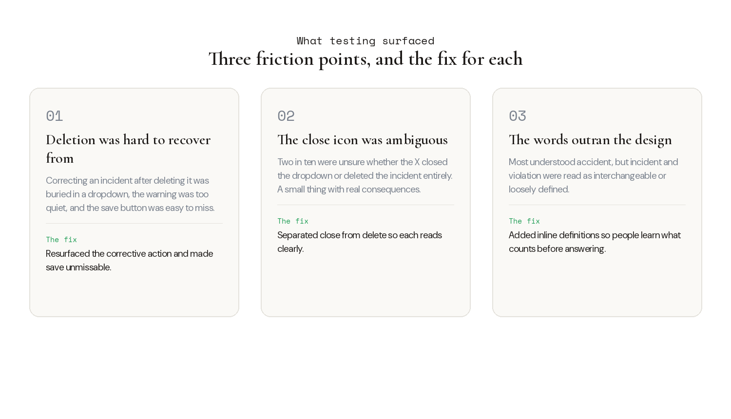
Deletion was not intuitive. Half the participants struggled to correct an incident after deleting it, because the corrective action was buried in a dropdown, the warning was too quiet, and the save button was easy to miss, so some people hit back instead of finishing the fix. The close icon was ambiguous, with two in ten unsure whether the X closed the dropdown or deleted the incident entirely, a small thing with real consequences in a high-stakes flow. And the language was doing work the design was not supporting: most people understood "accident" right away but were unsure about "incident" and "violation," treating incident and accident as the same and violation as loosely defined.
The solution
Define the terms, then ask the question
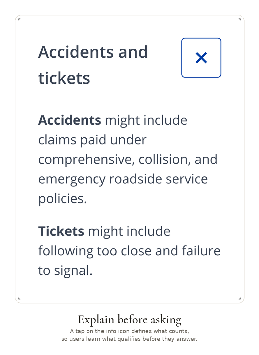
The language finding had a direct fix. A tap on the info icon defines what actually counts as an accident or a ticket, in plain language rather than policy jargon, so people learn what qualifies before they answer. It defuses the "will this hurt my quote?" worry at the moment it spikes.
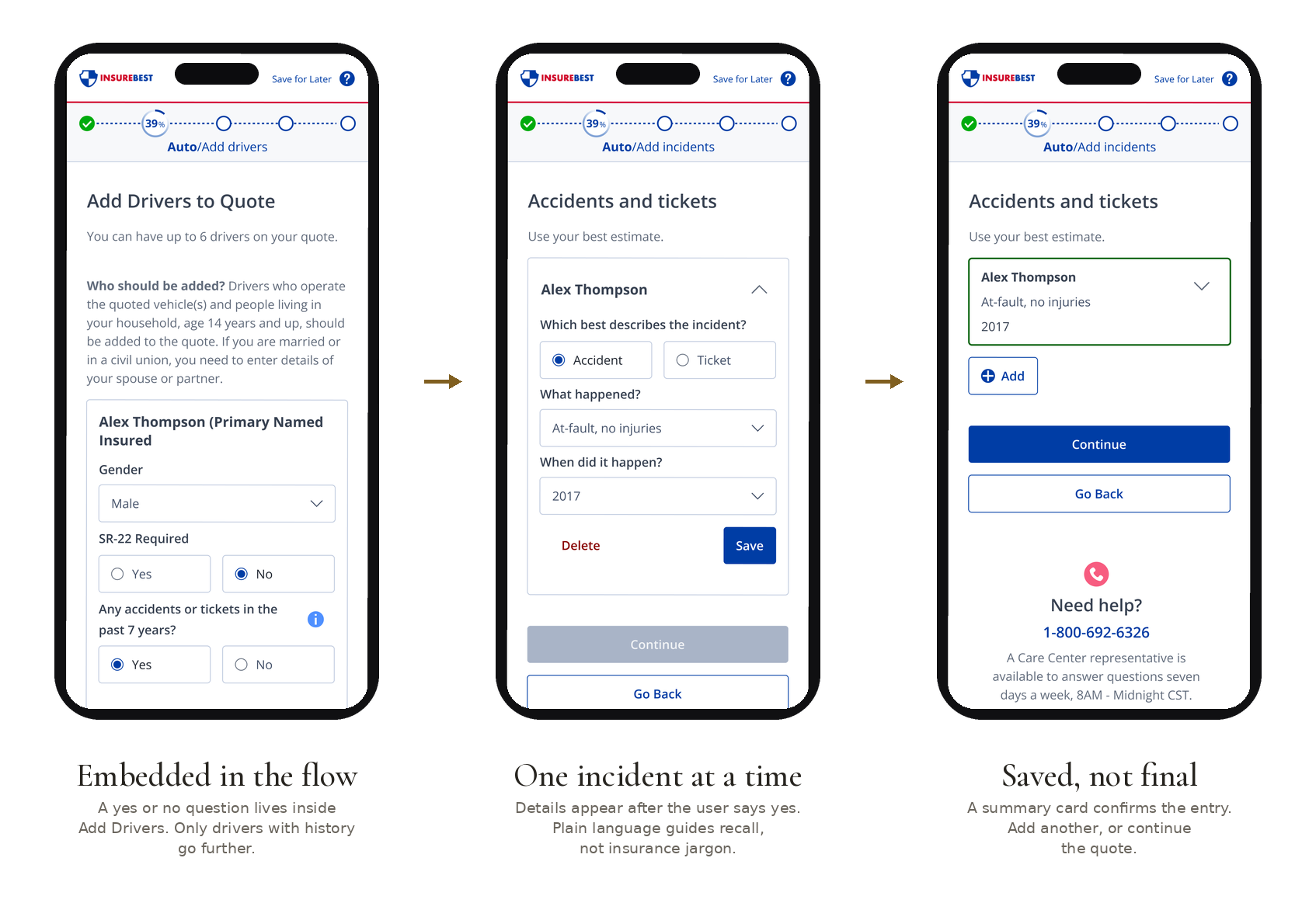
The step itself threads into the flow in three beats. It starts as a single yes or no question inside Add Drivers, so only drivers with history go any further and nothing extra is asked of people it does not apply to. When the answer is yes, details appear one incident at a time, with plain language guiding recall instead of insurance terminology. A summary card then confirms each entry, with the option to add another or continue the quote. The result is a legal disclosure that reads as transparent rather than punitive.
Results
Validation through usability testing
For users
Confident, informed history entry. A clear view of what counts and why. Trust built earlier in the process.
For business
Digital capture reduces backend surprises and quote discrepancies. Leads reaching agents are higher quality and better informed, and conversion is preserved while trust is built earlier.
Reflection
This one taught me that the most meaningful design work sometimes happens inside someone else's business decision. The ask was transparency. The real opportunity was turning a legal disclosure into a feature, something that made the process feel like it was on the user's side.