02 of 05 · Insurebest quote journey
Agent Awareness
Introducing a trusted relationship while people are still shopping, not after the money is spent.
The context
Shopping for insurance means making a big decision alone, on a screen
Most people now buy insurance the way they buy everything else, on their own, in a browser, comparing options they cannot fully see. But insurance is not a normal purchase. The stakes are high, the language is unfamiliar, and the consequences stay invisible until something goes wrong.
For decades the person who closed that gap was an agent, a human who explained the tradeoffs and stood behind the decision. In Insurebest's digital flow, that person barely showed up, and when they did, it was already too late to help.
In the existing experience, the agent arrived as a task rather than a presence. Selection sat late in the flow, buried under another step, after most of the real decisions were already made.
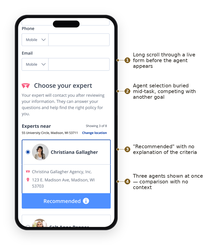
The problem
Business problem
Agent relationships are a competitive strength for Insurebest, but the digital experience treated them as an afterthought, introduced after purchase instead of during the decision.
Customer problem
Customers felt unsupported through a high-stakes decision, then were asked to choose an agent right after committing their money. Wrong moment, wrong ask.
UX problem
The entry point and the result felt disconnected. Agent selection landed on a page already dense with critical information, near a high-conversion moment, and it could not be a modal or a standalone page.
My role
Lead designer on the agent awareness experience, partnered with product, research, and content. The pivotal move was mine. Product had scoped this as an agent selection feature dropped onto an already crowded page. I reframed it as an agent awareness problem, aligned partners around that shift early, then explored patterns and delivered the final design.
The brief
The ask came with hard limits
The written user story was direct: as a digital shopper, I want to see the agent associated with my quote and have the option to change to someone else, so I can work with the agent who suits me best.
The constraints were just as direct, and they were the real design problem. It could not be a modal. It could not be a standalone page. It had to be a minor, nonintrusive subtask that never competed with the primary task. On desktop it needed to live in the right rail, and it had to be present across the quote flow, from adding a driver through the quote pages. The work was fitting a human introduction into a system that had no room to spare.
The reframe
People don't need to choose an agent early, they need to know one exists
Prior research on how shoppers feel about agents during digital quoting pointed one way: agents are valued as backup, not as salesy blockers. Forcing a choice mid-quote fought that instinct. Signaling that someone was already there worked with it.
The language on the screen carried the shift. "Choose your expert," which reads as another task, became "Your agent," which reads as a relationship already in place. I looked outside insurance too, at how real estate profiles and marketplace team cards introduce a person without demanding a decision. Presence is different from action.
Exploration
Finding the least intrusive way to make a person feel present
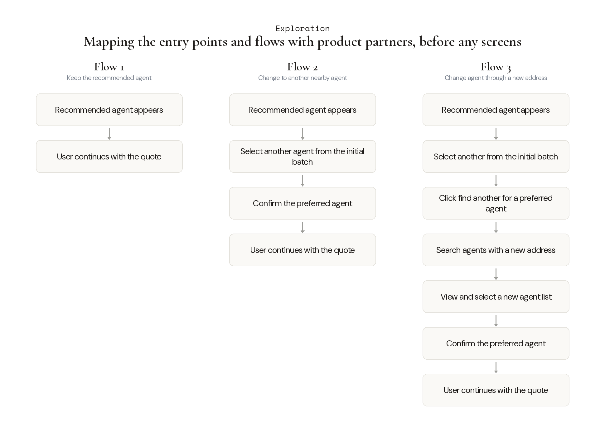
Before any screens existed, I sat with product partners and mapped the possible paths. Where could the agent enter the quote, and what would happen if someone kept the recommended agent, wanted a different one, or needed to search a new area? That early mapping is what the design had to support end to end.
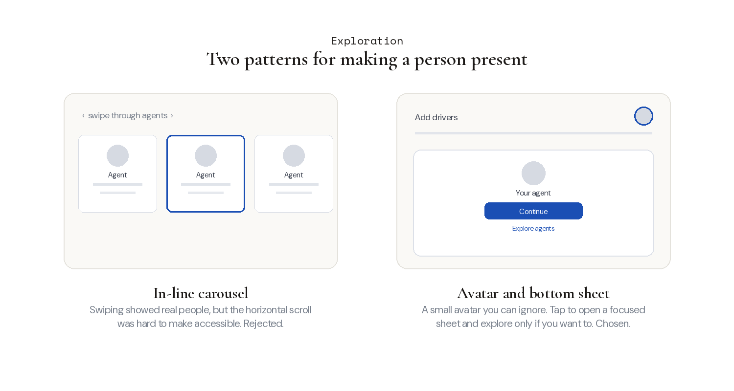
With the paths mapped, I explored how the agent should actually appear on screen. I tried an in-line card and carousel first, letting people swipe through agents inside the flow. It communicated real people, but I flagged it myself: the horizontal scrolling was hard to make accessible, and it added weight to a step meant to stay light.
So I moved to an avatar paired with a bottom sheet. A small avatar sits in the flow and stays ignorable. Tapping it opens a focused sheet with the assigned agent, with the option to explore others only if the user wants it. That choice was driven by accessibility and by the constraint that this had to remain a minor subtask.
The solution
An agent who is present in the flow, never blocking it
The final design introduces the agent while people are still shopping, so help feels available without being demanded. One agent is assigned by proximity, and exploring others is always optional.
On mobile, the experience is a bubble you can ignore. Reach the page, see the avatar, and keep going if you are focused. Tap it and the agent card appears in a bottom sheet. Comfortable with the assigned agent? Continue. Want options? Explore pulls a short list of four nearby agents, and expands to eight only if you ask, since the goal is not to overwhelm. Change your agent and a success toast confirms it, then returns you straight to the quote.
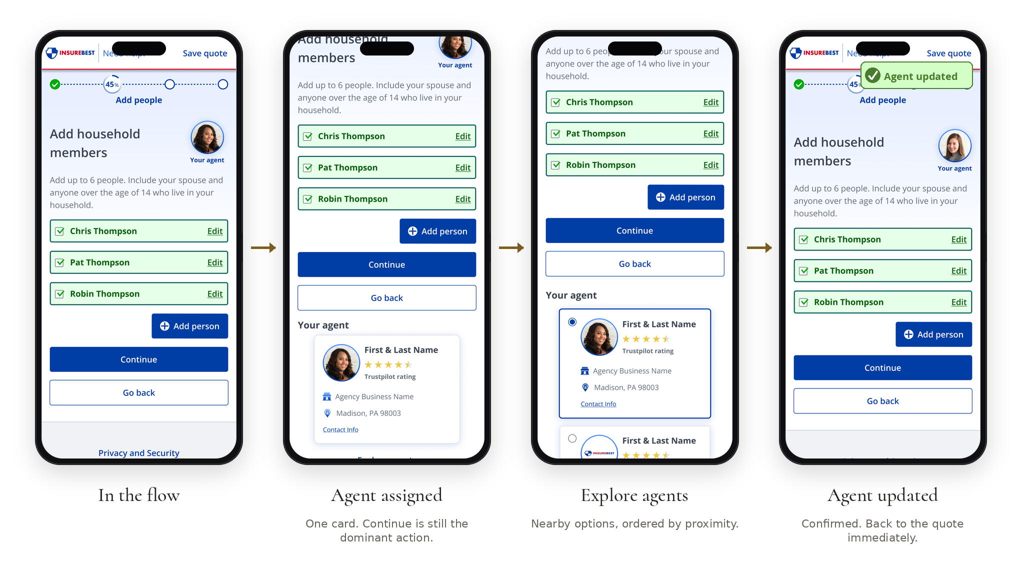
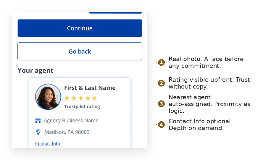
The card earns its place with a few deliberate choices. A real photo puts a face before any commitment. A visible rating builds trust without marketing copy. Proximity does the assigning, so the nearest agent is the default. Contact details stay a tap away rather than sitting on the card, which came directly from a product-partner note: drive people to reach out to the agent, but keep the digital flow clean, so reveal the phone and email only when someone engages.
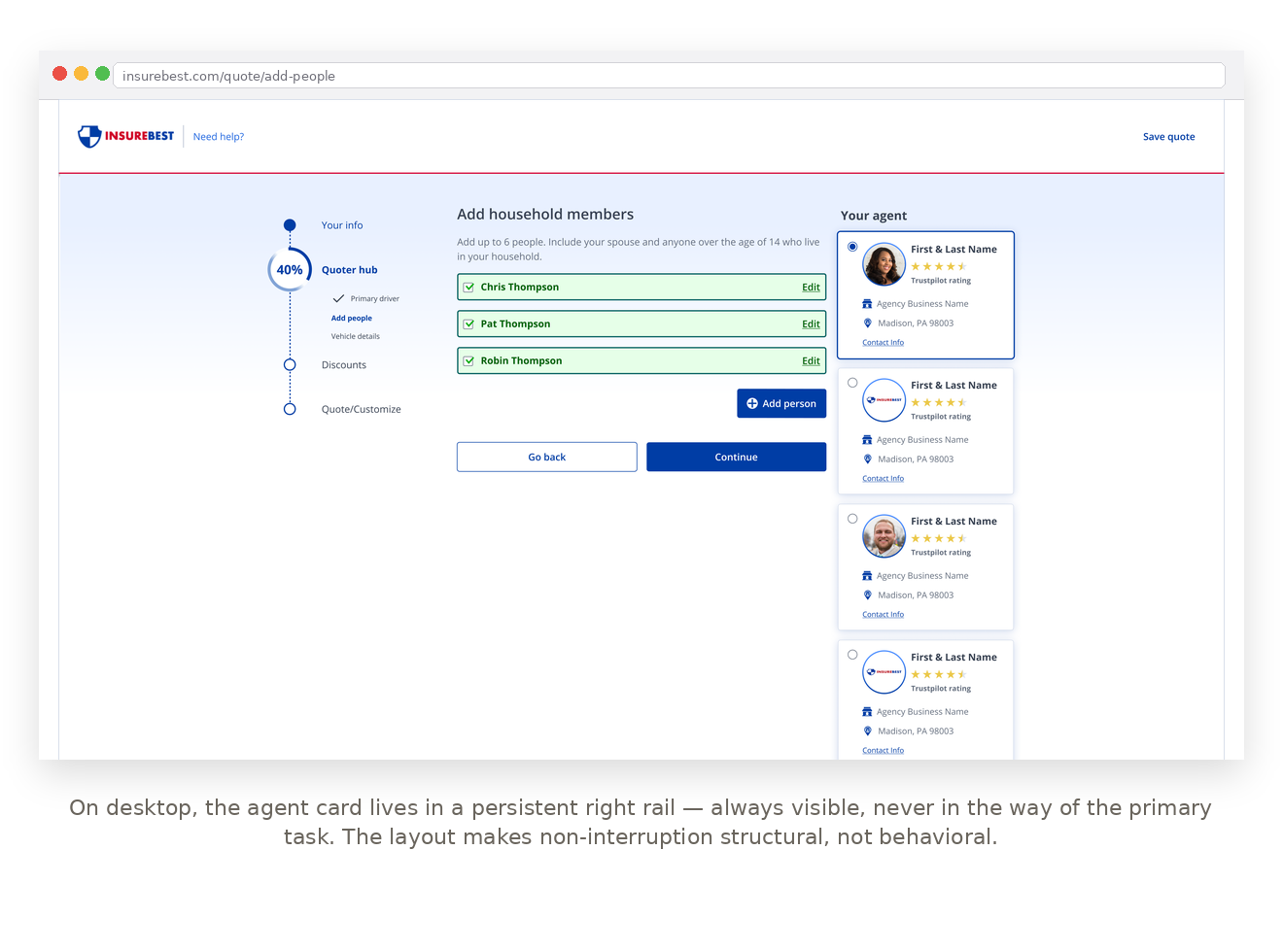
On desktop, the card lives in a persistent right rail, always visible and never in the way of the primary task. That placement came from a product-partner review as well, moving the avatar to the far-right column so it stopped feeling out of place. The layout makes non-interruption structural, not a matter of behavior.
Results
For users
The agent relationship is visible while shopping. More confidence, less cognitive load at the moment of commitment, and no forced decision.
For business
No new pages. Constraints respected, both a modal and a standalone page avoided. The agent relationship surfaced earlier without hurting conversion.
Reflection
The hardest part was not the card. It was fitting a human introduction into a flow that had no room for one, without turning it into another task. The work was mostly restraint: an avatar you can ignore, a sheet that opens only if you are curious, a rail that stays out of the way. Presence, not pressure.