01 of 05 · Insurebest quote journey
Quote Customization
Making a single, business-mandated quote clear enough to adjust with confidence, at the highest-stakes page in the funnel.
The landscape
Insurance is a product people buy and hope to never use
When someone shops for auto insurance online, they are comparing products they cannot physically see, using terminology they may not fully understand, with financial consequences they will not know until something goes wrong. The quote page is where this tension peaks. It is the moment a shopper decides to commit or leave.
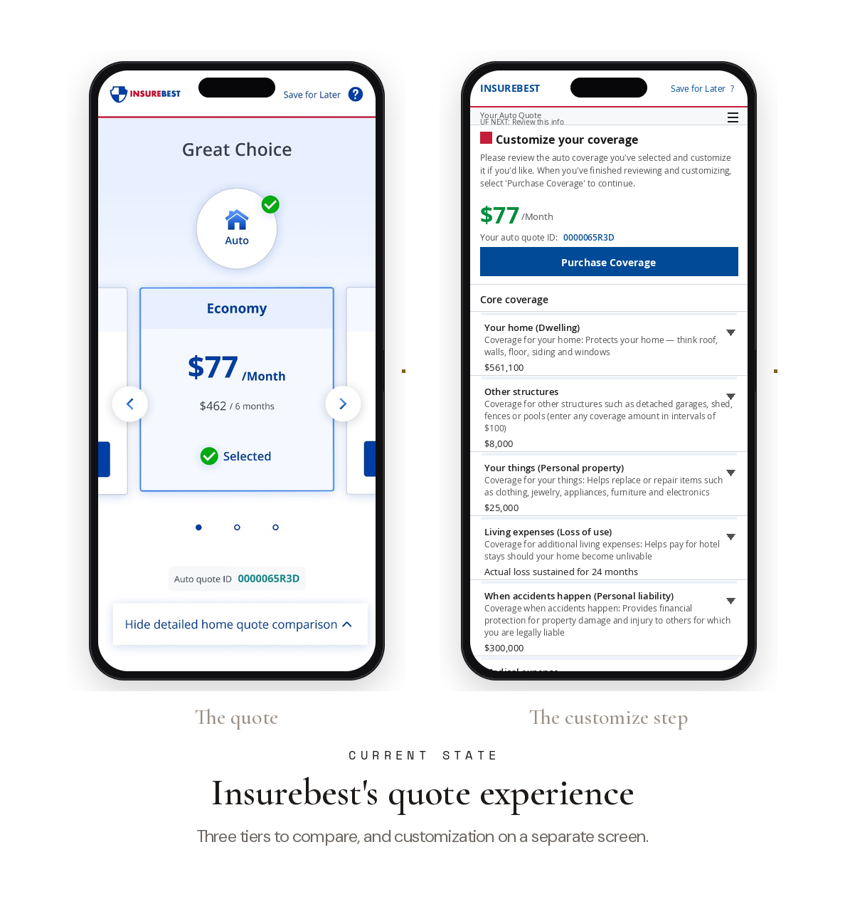
The experience stood in two places. The quote itself was a three-tier comparison, Economy, Traditional, and Premier side by side, asking people to choose before they understood the differences. And customization lived on its own separate screen, disconnected from the price it affected.
The problem
Business problem
Quote page conversion was not meeting targets. The three-tier comparison model was the highest-traffic, highest-stakes page, and it was underperforming.
Customer problem
Users could not tell what they were buying, how price connected to coverage, or which option fit. Comparison caused hesitation, not confidence.
UX problem
Information density was prioritized over clarity. Three tiers presented at once created choice overload at the worst possible moment.
The direction
The business simplified the offer to a single quote
The move away from three tiers was a business decision. Rather than offering Economy, Traditional, and Premier, the business chose to surface the single most-sold quote and route customers who needed more help toward an agent. I designed from that mandate and from an existing quote-page sketch the team had already outlined, so the overall direction was set before the design work began.
What I owned was everything that came after the decision: making one quote legible, showing the price-to-coverage relationship plainly, and letting people adjust without second-guessing. All of it had to fit inside backend limits that shaped which interaction patterns were even feasible on a page this sensitive to conversion.
My role
Lead designer on the quote customization experience. I partnered with product, research, engineering, and content, and worked from a direction set with the User Experience lead. I owned the design from research synthesis through usability testing and final handoff.
What I heard
What people actually needed was to understand value
The product story set the target plainly: as a digital shopper, I want to understand what a policy costs so I can compare it and decide whether to buy. From that, the design goal was concrete. Give customers clear visibility into what coverage is included, how their changes affect cost, and what their recalculated selections actually are.
Reviewing Customer Experience research and usability studies pointed to the same insight, and it challenged an assumption. The side-by-side comparison that was meant to help people decide was actually making them hesitate. So I studied how adjacent industries guide complex choices, like benefits selection, flight search, and e-commerce, to find patterns for structuring a decision instead of dumping options.
Iteration
Clarity came down to small, scannable decisions
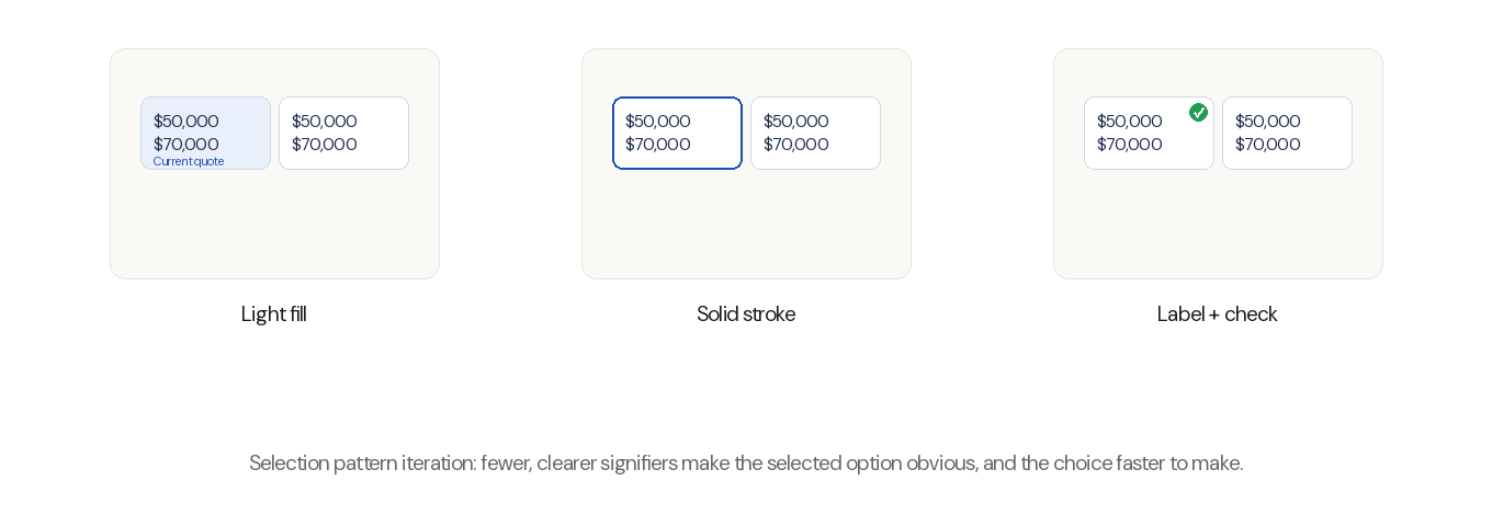
Early ideas explored how to make one quote readable at a glance: how to mark the current selection against a newly chosen one, and how much visual weight each coverage tile should carry. As the direction refined, a handful of specific calls did most of the work.
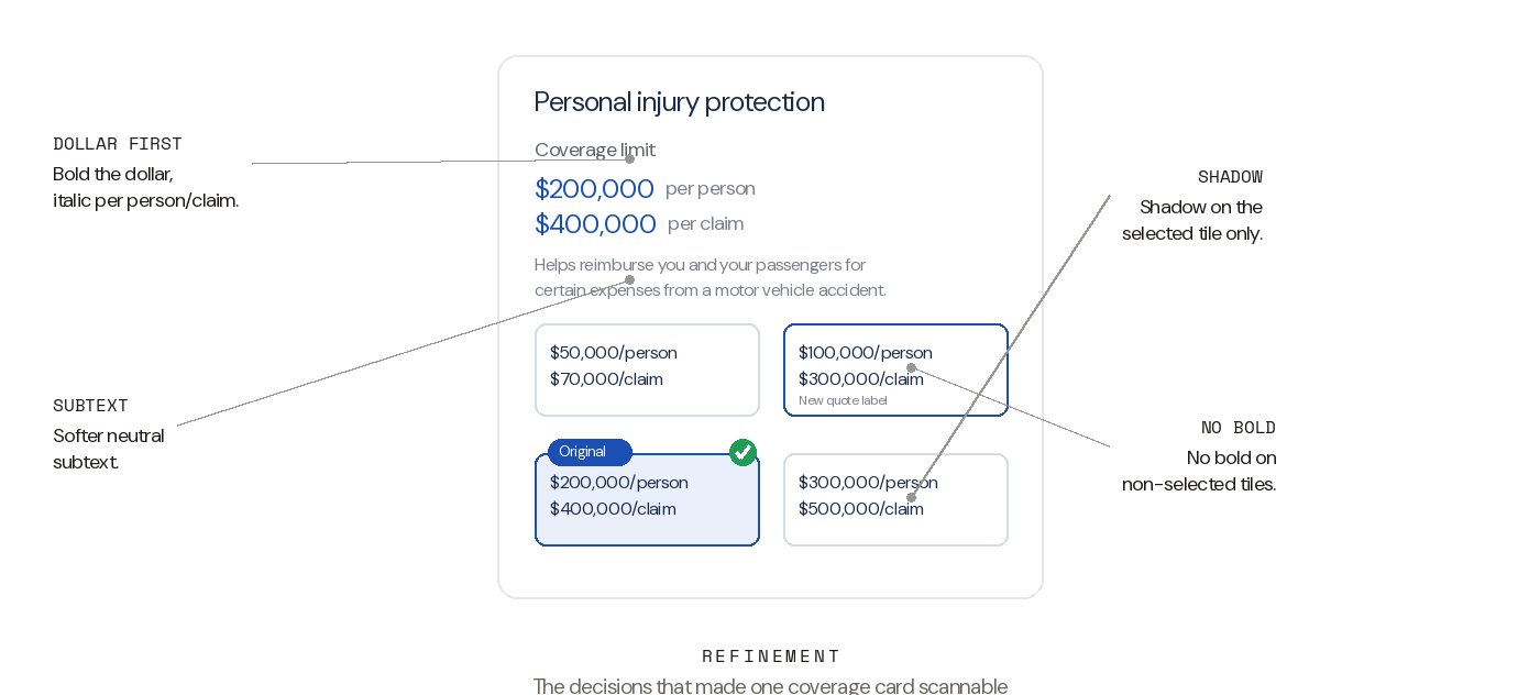
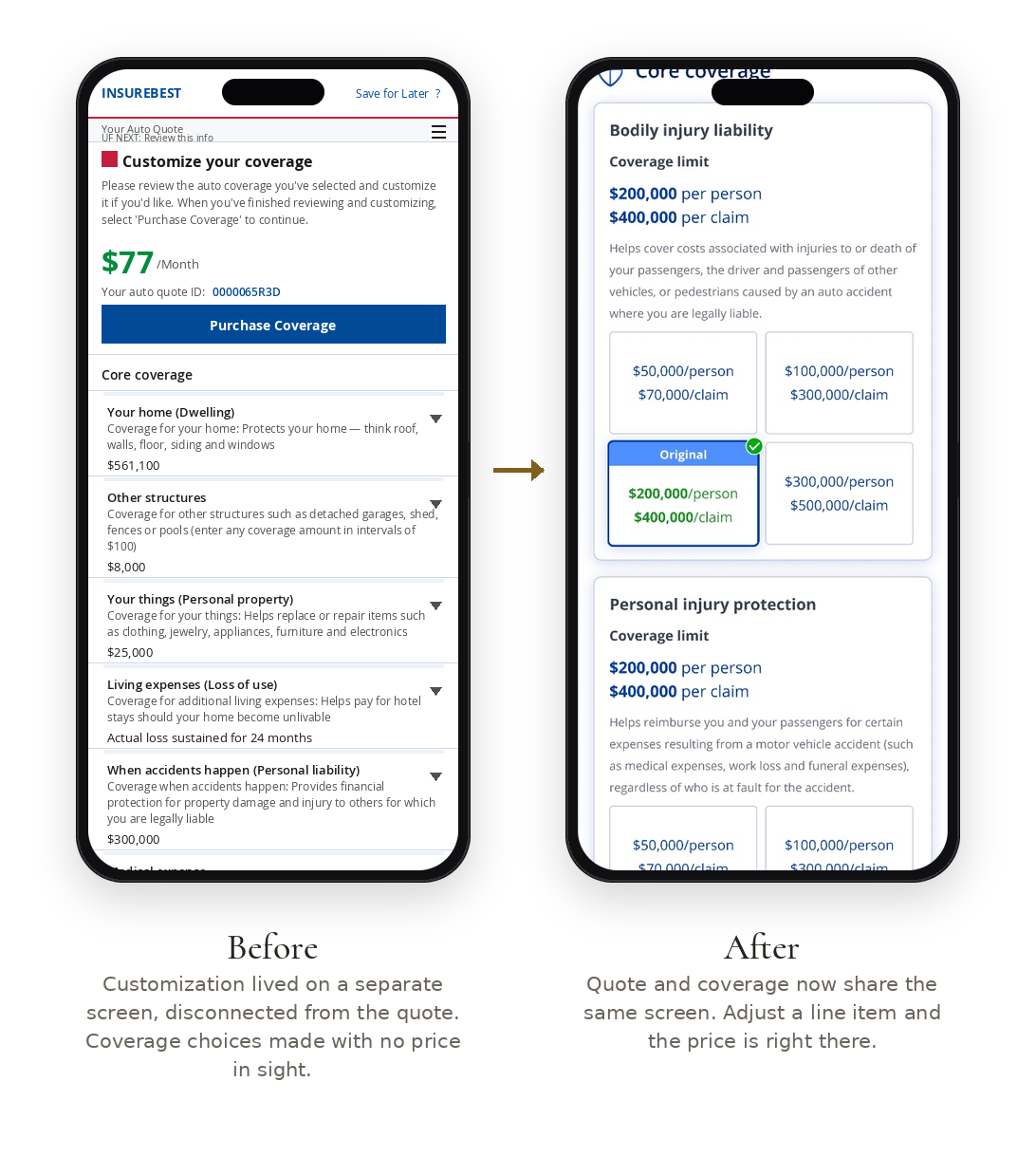
I bolded only the dollar amount and italicized the "per person / per claim" detail, so the eye lands on price first while scanning a coverage card. I took the bold off the non-selected tiles to reduce cognitive load, and I gave a shadow to only the selected tile so the active choice separates cleanly from the alternatives. The subtext moved to a softer neutral to match the hierarchy of the broader .com.
Accessibility set real limits on the visual language. I tested the layout at 200% zoom, and I moved away from dotted-stroke selection cues because they are not an intuitive, widely understood pattern, and leaning on a single stroke style to signal state does not hold up. Later in the process, a colleague and I aligned on clearer pre-custom and post-custom visual cues, so the shift between "original" and "your quote" reads without a second look.
The solution · The quote
One quote, clear enough to actually read
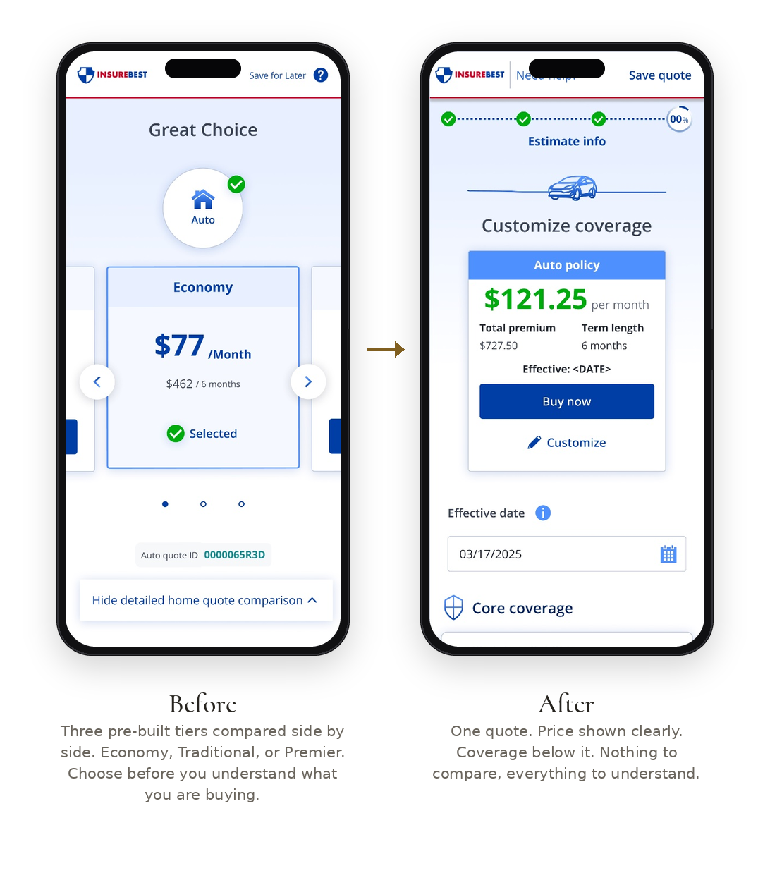
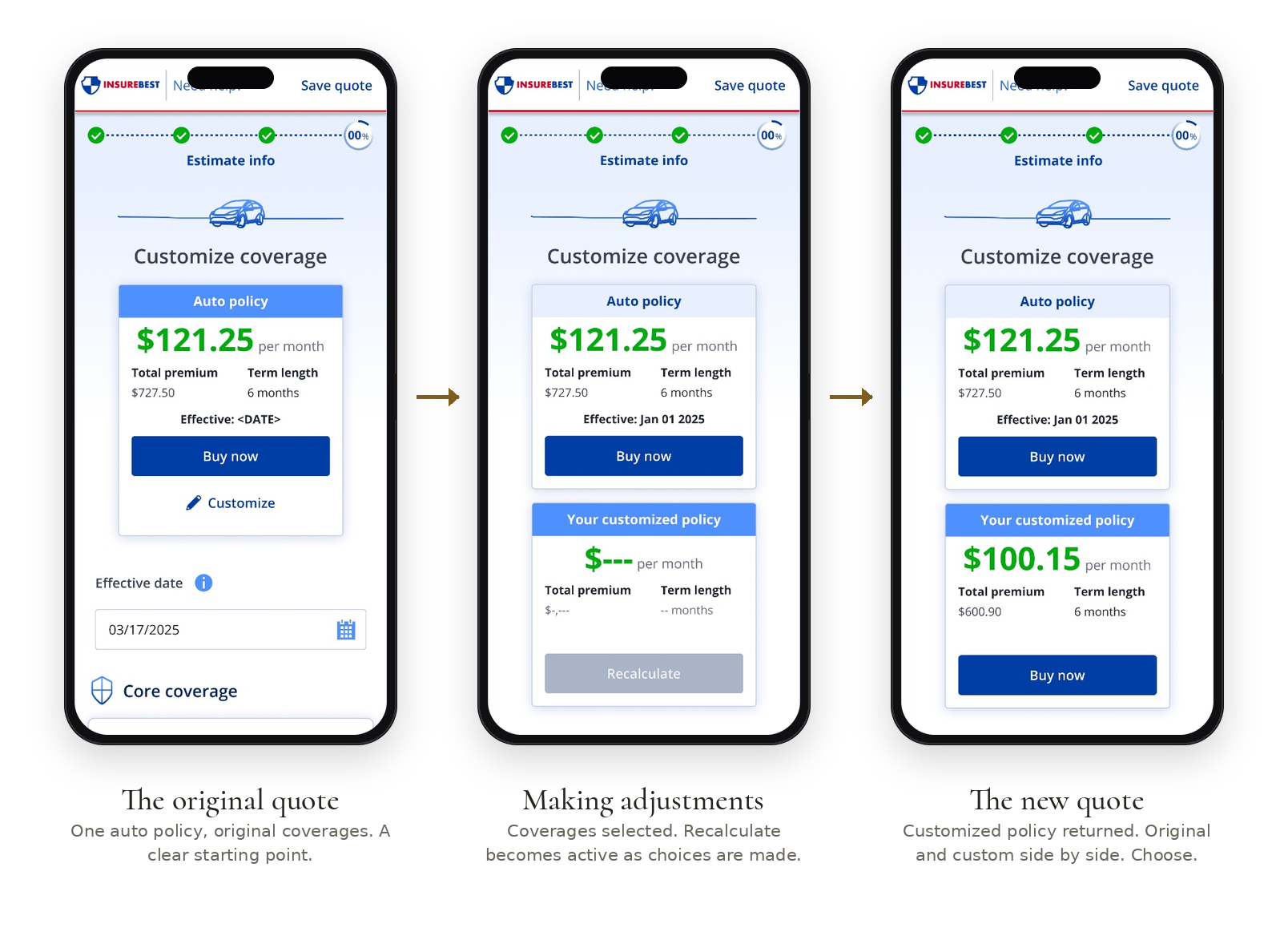
The three-tier comparison collapses into a single clear quote. One price, shown plainly, with the coverage sitting right beneath it. Nothing to compare, everything to understand. The decision stops being "which of these three?" and becomes "do I want to adjust this one?"
The solution · The customize
A quote you can adjust and watch respond
Customization used to live on a separate screen, disconnected from the quote, where coverage choices were made with no price in sight. Now quote and coverage share one screen. Adjust a line item and the price is right there. The interaction closes the loop, recalculating in real time so a customer sees the original and their customized price side by side before deciding.
Static comparison forced people to guess at value. Visible cause and effect lets them build it.
Results
Validation through usability testing
Reflection
The business made the big call, one quote instead of three. Everything after it was mine to figure out: how to make a single quote legible enough that someone could adjust it without second-guessing. The reframe got the attention, but the work that mattered was quieter. Which number to bold. When a shadow does more than a stroke. Whether a cue still reads at 200% zoom.