05 of 05 · Insurebest policy management
Proof of Insurance
Designing a renewal card that still works when the system has not caught up yet.
The context
The insurance card is the one thing people actually reach for
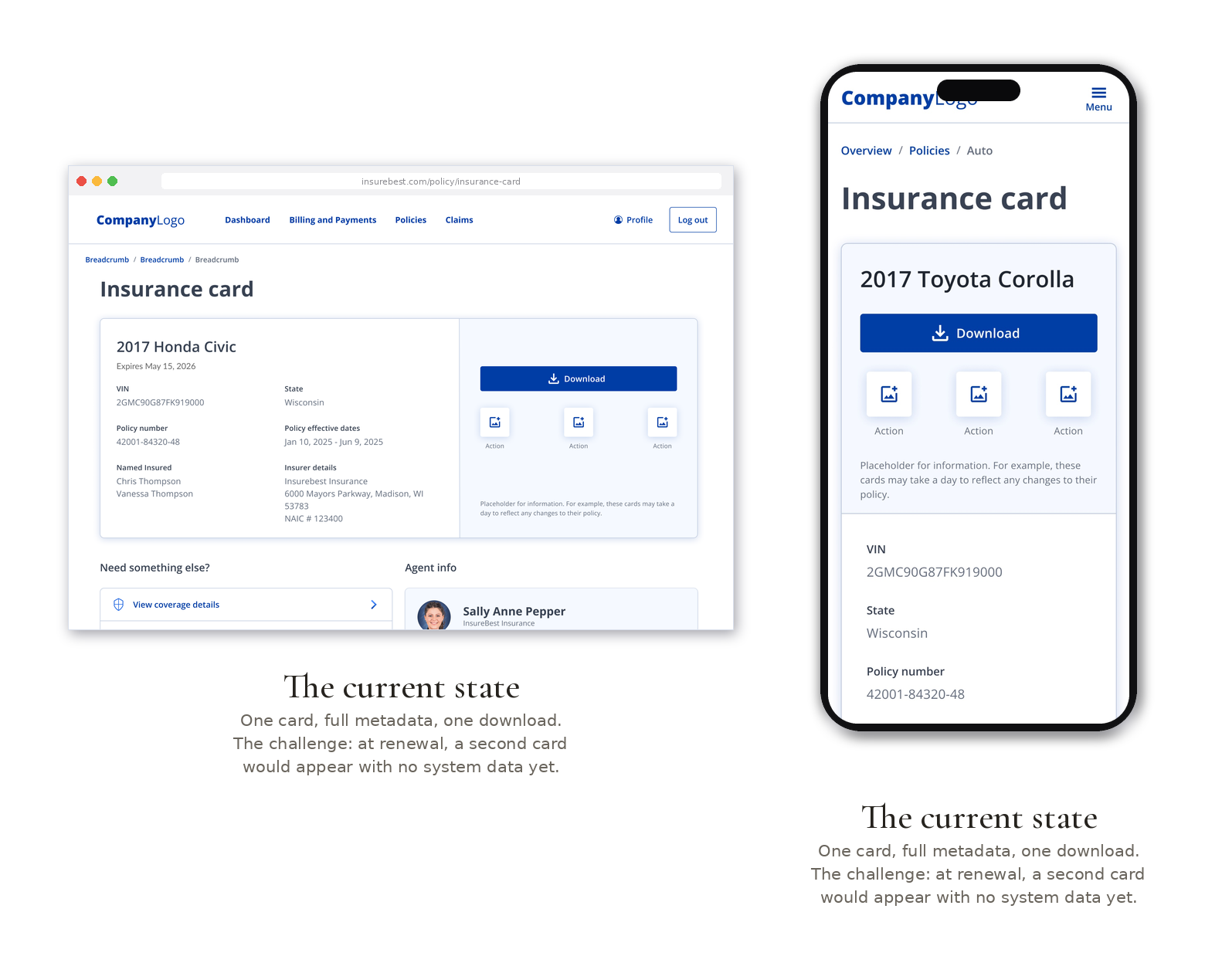
Proof of insurance is one of the few pieces of a policy people genuinely need in hand. It comes up at the DMV, at a traffic stop, when a lender asks. So the card has to be easy to find, easy to download, and correct. Today that works cleanly: one card, full details, one download.
The moment it gets interesting is renewal. When a policy renews, a customer needs to see both cards at once, the current term and the upcoming one, so they always have valid proof on hand through the transition.
The problem
Business problem
Customers need both current and renewal proof-of-insurance cards at renewal. The card component had to support that across the mobile app, mobile web, and desktop without a separate one-off build.
Customer problem
At renewal, the second card would render with no data, because the details did not exist yet. A card that looks empty reads as broken, right when a customer is trying to confirm they are covered.
UX problem
The backend does not generate renewal-card metadata immediately. So a naive stacked view put a fully populated card next to a blank one, exposing a technical limitation as if it were a bug.
My role
Lead designer. The turning point was upstream of any screen. While mapping how the renewal card would populate, I traced the flow back with engineering and found that the upcoming term's metadata simply is not ready at renewal. Left alone, that would have shipped as a blank card. I raised it, then designed the lifecycle states around it, and built the pattern into the shared base-component system so pending states behave the same everywhere, not just on this one screen.
The reasoning
Design the pending state on purpose, so it never looks broken
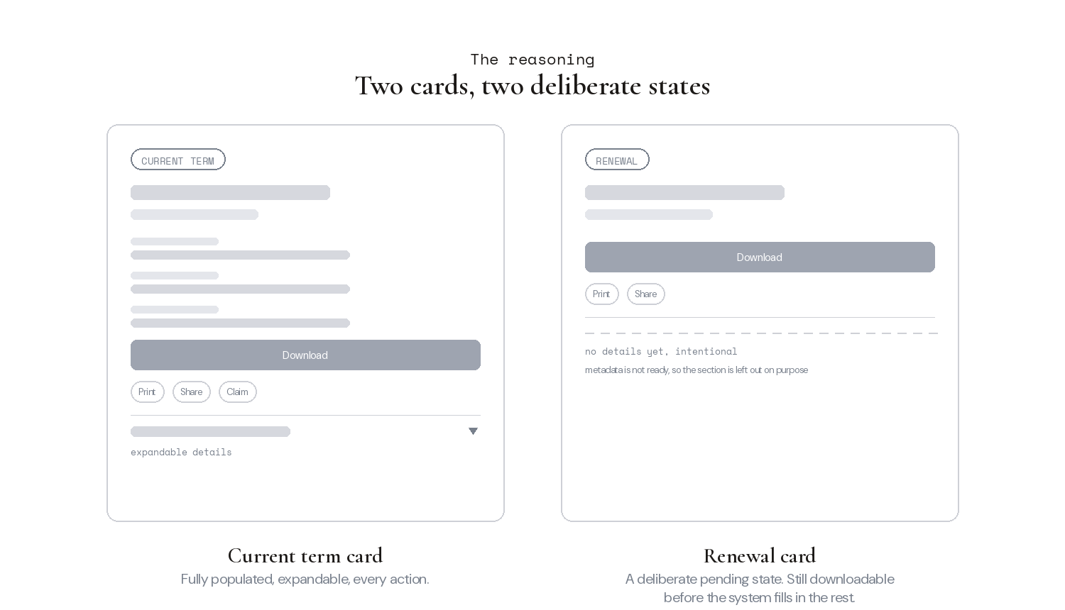
The constraint forced a sharper question. What does a customer actually need from a card that is not fully active yet? Not metadata they cannot verify. They need to get it, keep it, and prove it. So the two cards were built as two deliberate states rather than one template with a hole in it.
A few decisions carried the design. Stacked view, so both cards sit in view at a glance and only the current one expands, matching the desktop experience. Differentiated states, so the renewal card reads as a distinct, intentional thing rather than an empty error. Actionable even while pending, so a customer can still download, print, and share the renewal card before the system fills in the rest. And all of it working around the backend limit quietly, so the person never sees the technical reason underneath.
The solution
Metadata on the current card, actions on the renewal card
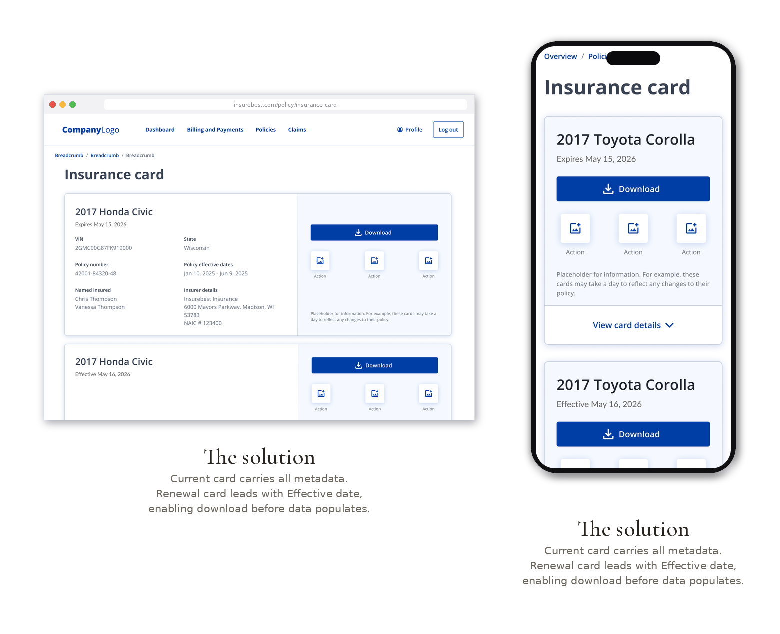
The current term card carries everything: full policy details, an expandable view, and every action. The renewal card leads with its effective date and offers the actions that matter most, download, print, and share, so a customer can save valid proof before the backend has populated a single field. Pills distinguish the expiring and effective dates at a glance, and state is never carried by color alone.
The renewal card shows up as an intentional near-empty state, not a broken one, and it lets people download even when the data on the card is not available in the system yet. It was built as one shared component spanning personal lines, commercial lines, POI, and EOI, and I repurposed the app's sticky menu into a Quick Links section that doubles as a self-service hub, opening a natural cross-sell moment without adding load.
Results
For users
Valid proof of insurance through renewal, with no blank card and no confusion. People can download and share the renewal card the moment it exists, not once the backend catches up.
For the system
One component across all policy types and platforms, scalable, maintainable, and consistent. Quick Links added a self-service hub with a built-in cross-sell path.
Reflection
The best fix here was not a prettier card. It was catching a system limitation before it reached anyone, then designing a state that told the truth: this card is not fully ready, and you can still use it. Good design often looks like a problem the customer never finds out they had.