A system for the people closest to someone's drug use, who had nowhere designed for them.
"No one designed anything for people like me."
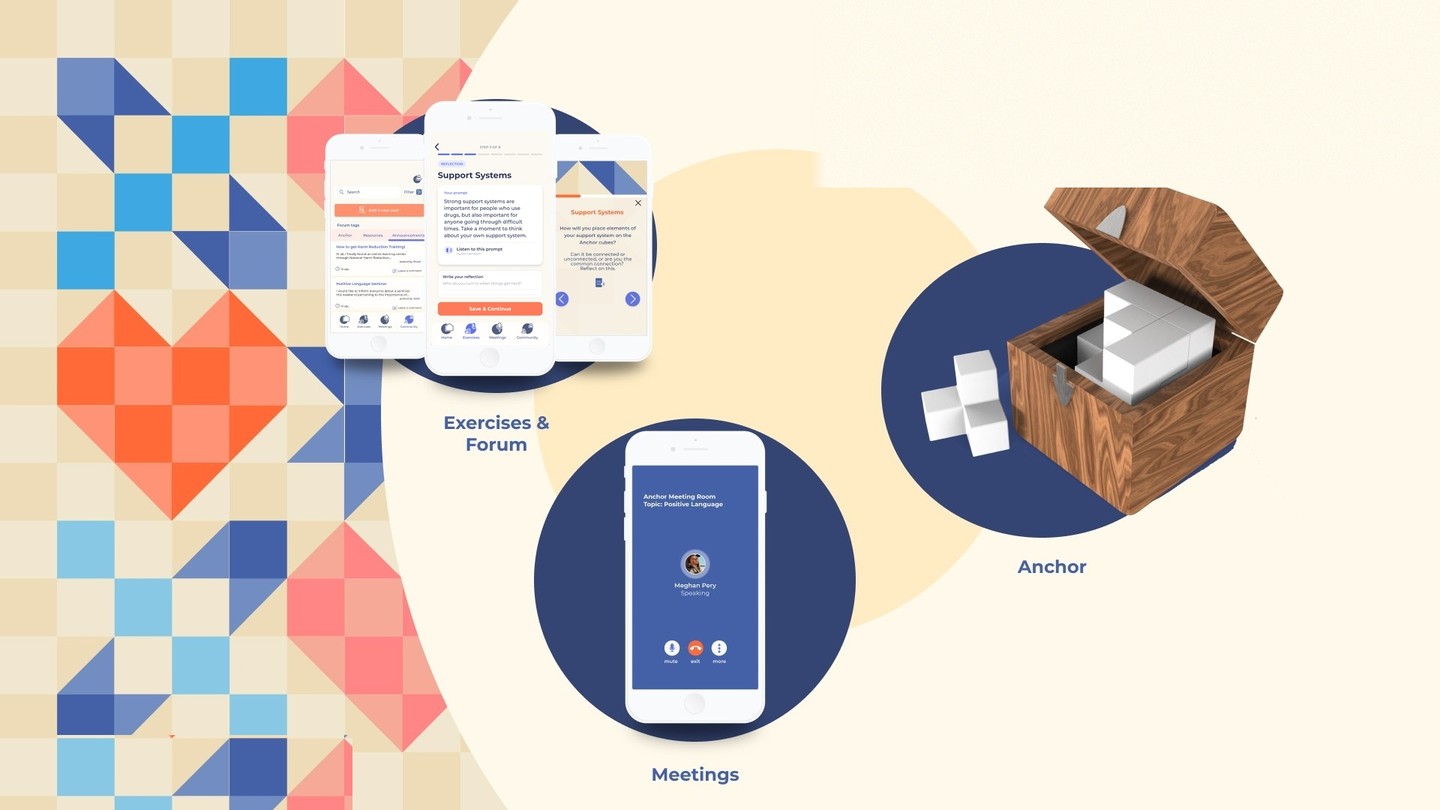
Three access points into one connected system: the app, the meetings, and the Anchor.
Anchoring Love is a hybrid support system built for the friends, family, and partners of people who use drugs, three access points working together: a physical object, a guided app, and real meetings. This case study walks through the paper prototype and the real conversations that shaped it, and what testing eventually proved right and wrong.
01 · Problem space
Families have a vital role in how this plays out at home, and almost nothing was built for them
When someone struggles with substance use, nearly every resource, every program, every conversation centers on that one person. But the people around them, friends, family, spouses, and partners, carry their own confusion, fear, guilt, anger, and grief, often with no outlet at all. Our research kept landing on the same line, and it became the thesis of the whole project.
Families have a vital role in the development and resolution of how substance use impacts their home.
Who
Friends, family, spouses, and partners of people who use drugs, consistently excluded from the systems built to help.
Why this group
Uniquely positioned for earlier intervention, intervention in emergencies, and increasing the odds a loved one engages with services and stays in treatment.
02 · The people
Two people, one shared silence
The research kept surfacing the same shape. Different demographics, different relationships to the person using drugs, same lonely middle. To keep design decisions honest, we grounded the work in two composite people drawn from real interviews, and returned to them at every fork.
Persona 01
Ariel
Sister to someone using
Where she is
Tangled emotions she can't name. She has all the feelings, and none of the language.
What she's looking for
A private way to put things down before she has to say them out loud, and eventually a way to help someone else the way she wasn't helped.
Persona 02
Rosa
Partner to someone using
Where she is
Carrying emotions she has no idea what to do with. Existing groups center the person using, not her.
What she's looking for
A space built for the loved one, where showing up is enough and being heard doesn't require performing recovery.
03 · The frame
What we were actually trying to solve
Three questions shaped everything that followed.
How might we ease the strain, where possible, in maintaining a relationship with someone who uses drugs?
How might we increase a family's understanding of their loved one's unique journey?
How might we bridge the range of perspectives on drug use into one supportive network, rather than a divided one?
Underneath all three was a single thesis: this could not be another program that asked people to process alone. It had to hold complexity, not resolve it for them.
04 · The research
Research kept surfacing the same tension, from different angles
Interviews with clinicians, program leads, and families kept returning to a shared observation: the system for people who use drugs was rich, and the system for the people around them was almost nonexistent. A few voices captured it plainly.
The pandemic may wind up helping because we are forced to do things more digitally. No reason providers can't meet with people and provide services this way, or even through mail or contactless delivery.
Dr. Anita Jacobson, URI College of Pharmacy
Affinity mapping across interviews and desk research produced five insights that ran under everything else.
Support gap
Both people who use drugs and their families need physical, mental, and emotional support, but only one side of that pair is being served.
Equity gap
Social determinants of drug use disproportionately affect vulnerable and marginalized communities.
Constant flux
The harm reduction system is in a constant state of change, so any solution has to move with it.
Ability gap
There are many available resources for harm reduction, but many feel limited in their ability to actually use them.
05 · Ideation
Two people, two very different paths to the same relief
Early ideation moved fast and wide. Two directions carried furthest, and each was tested against a real situation through storyboards before we trusted it.
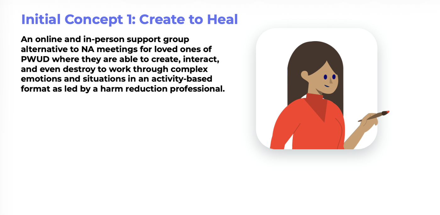
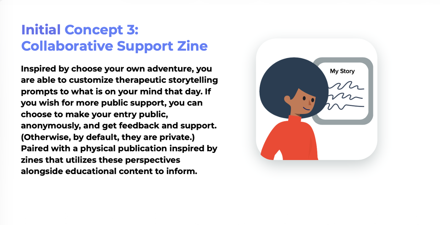
Concept 1: Create to Heal, a moderated meeting format where loved ones create, interact, and destroy to process emotion.Concept 2: Collaborative Support Zine, therapeutic storytelling prompts paired with a physical publication.
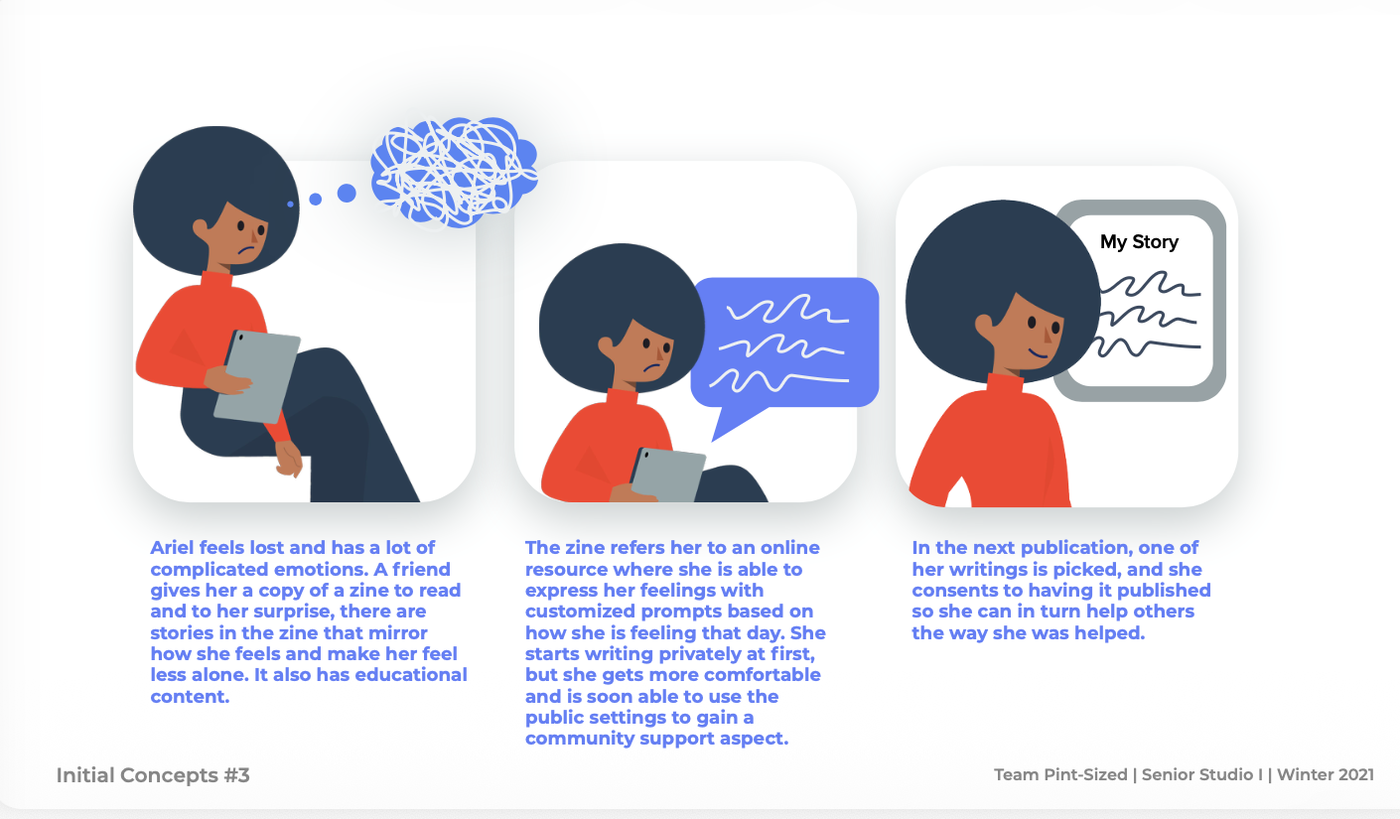
Two storyboards made the tension concrete. Ariel came in tangled, unable to name what she was feeling. A friend gave her a zine whose stories mirrored her own. She started writing privately, and eventually shared her story publicly to help someone else the way she'd been helped.
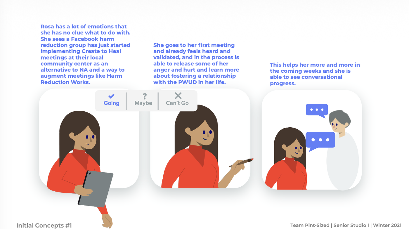
Rosa was carrying emotions she had no idea what to do with. She found a local Create to Heal meeting, RSVP'd, and showed up not knowing what to expect. She left feeling heard for the first time in a long while, and in the weeks after was finally able to see conversational progress with the person she loved.
Neither concept was wrong, but neither was quite right either. Concept validation surfaced a real tension: what people said they wanted and what they actually reached for didn't line up. That mismatch is what pushed the direction further.
06 · Testing
Everything the concept had to survive before it could ship
Testing happened in three streams at once: the physical form in people's hands, the mid-fidelity app in small user rounds, and the whole direction in front of practitioners who work in harm reduction directly. Each stream corrected something the others could not.
Beat 01 · Form factor
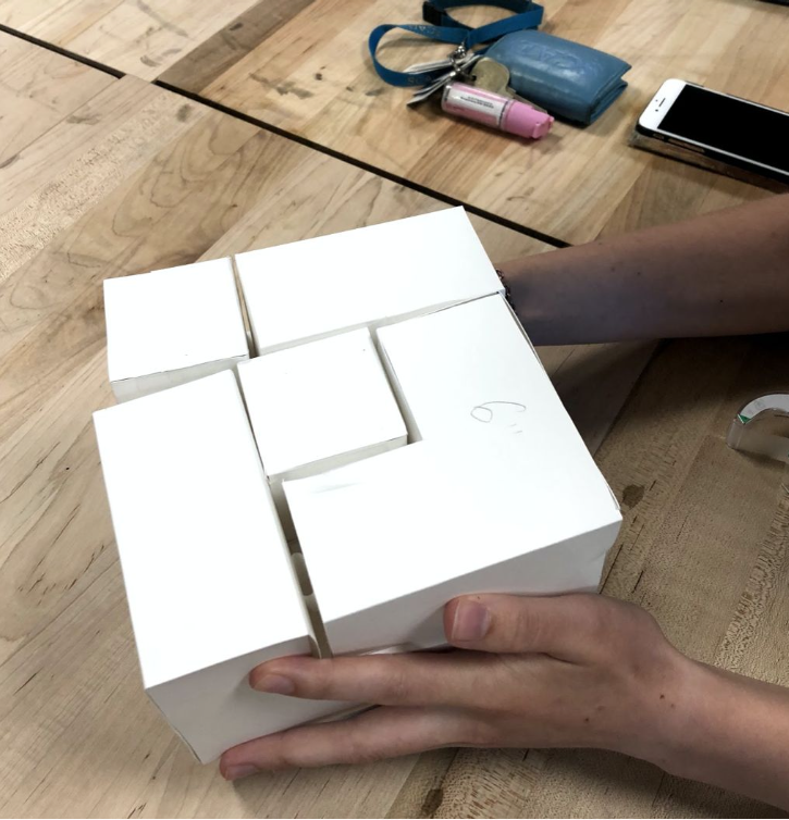
Before any digital screen existed, we built a paper model of what became the Anchor. Cardboard cubes, folded by hand, arranged and rearranged on a table. The question was whether an abstract shape could hold an internal state well enough to be worth building.
Paper prototyping, testing grip and form by hand.Anchor blocks, arranged and rearranged, decorated and redecorated, to reflect a changing relationship and internal state.
What we learned. The abstract, modular shape held up in hands. People liked being able to build, break, and rebuild it, which confirmed the arrange-and-rearrange logic could carry into the final product.
Beat 02 · Wireframes
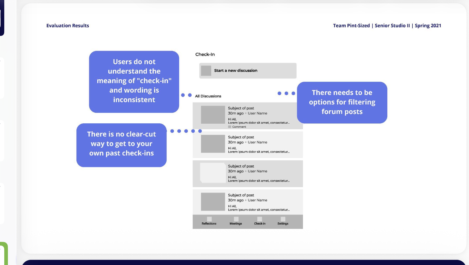
Mid-fidelity screens went in front of users in short rounds. Three screens surfaced problems worth acting on: the check-in space, the reflections view, and the home screen.
What we learned. The word check-in did not read as a space to reflect. People could not find their own past check-ins, and forum posts needed filtering to be usable at scale.
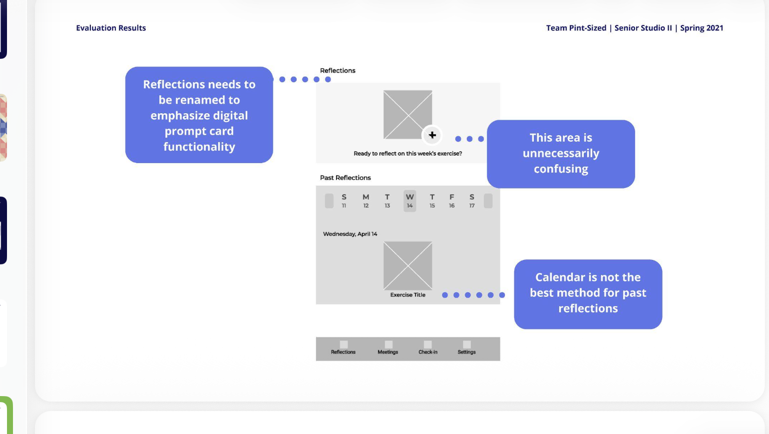
What we learned. Reflections needed a name that signaled the prompt-card interaction. The calendar view for browsing past entries added confusion instead of clarity, and needed a different structure.
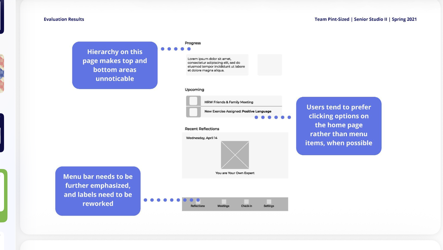
What we learned. Content at the top and bottom of the home screen went unseen. People reached for options embedded in the page over the menu bar, so the menu needed stronger visual weight and clearer labels.
Beat 03 · Validation round
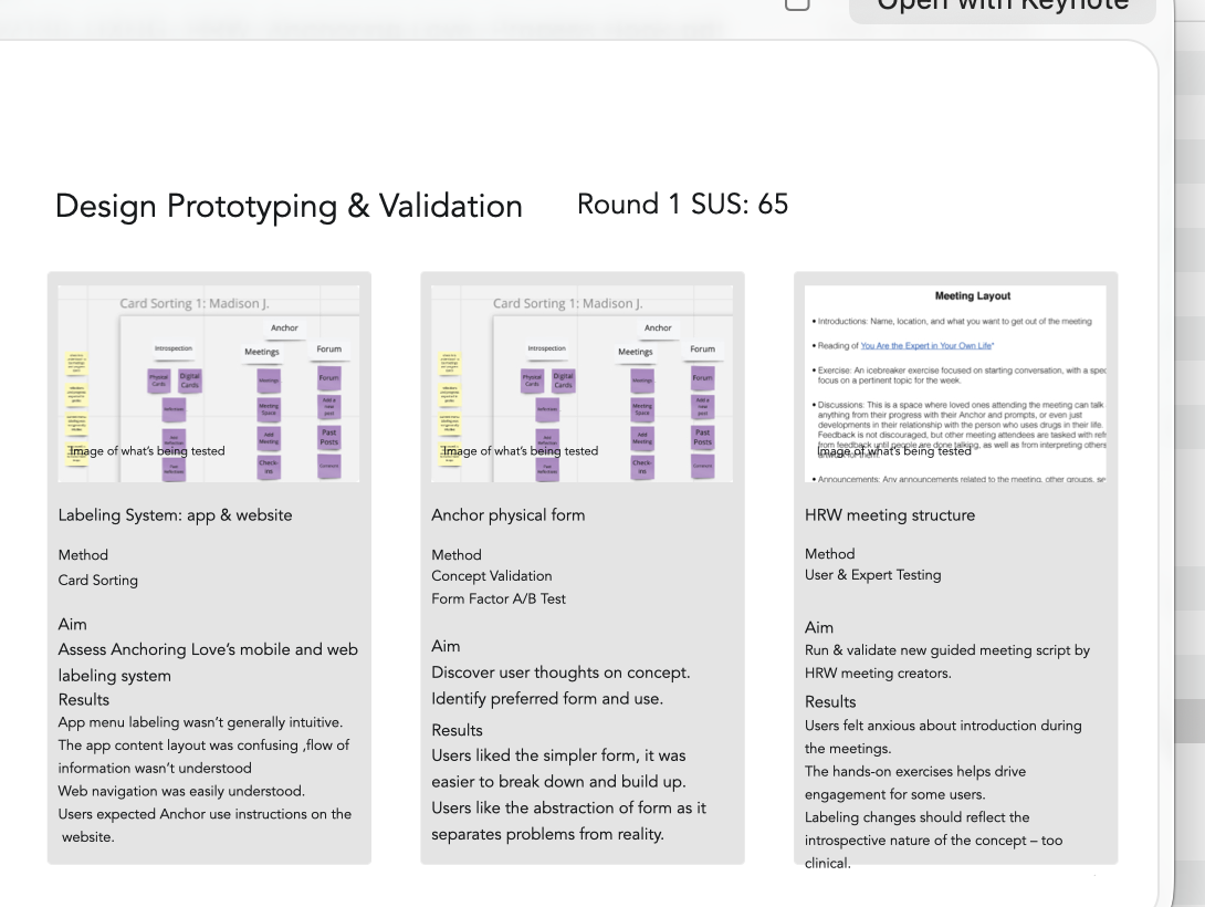
The validation round paired qualitative feedback with a card sort on the labeling system, a concept-validation A/B test on the Anchor's physical form, and a script rehearsal of the HRW meeting structure. That round produced the first System Usability Scale score for the app.
Round 1 usability testing
65System Usability Scale score, baseline round, tested across the labeling system, the Anchor's physical form, and the HRW meeting structure.
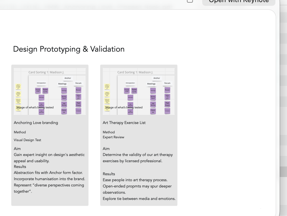
A second round tested the visual brand and the art therapy exercise list directly with practitioners.
Meeting experience
Anxious about introductions, specifically the word icebreaker. Hands-on formats drove more engagement. Some worried there wouldn't be enough time for everyone to speak.
Home screen
Top and bottom hierarchy went unnoticed. People clicked options on the page itself over menu items. The menu needed stronger visual emphasis and clearer labels.
Beat 04 · Practitioners
Alongside user testing, we ran the concept and the physical form past practitioners who work in this space directly. Their read on the direction is what let us commit to it.
Albie Park & Jess Tilley, Harm Reduction Works, project partner from day one.
Kept the direction grounded in what the community actually needed, not what we assumed.
Professor Nancy Campbell, historian of harm reduction and addiction policy, Rensselaer Polytechnic.
Checked the concept against the real history of the space, confirming we weren't reinventing something that already existed or missing something it should have addressed.
Susanne Fincher, board-certified art therapist.
Confirmed what our research kept circling: art makes it easier to process difficult emotion, and an open-ended prompt draws out more than a direct question ever could. That reframed the whole problem.
Courtney Hayes & Dr. Anita Jacobson, Truth Pharm and URI College of Pharmacy.
Validated the direction against real program and clinical experience, later in the process.
Labeling changes should reflect the introspective nature of the concept, too clinical. Group therapy and art therapy are terms we cannot use without the aid of a licensed mental health professional.
Expert review, licensed practitioners
07 · The solution
Physical, digital, and social, meeting people in different moments of need
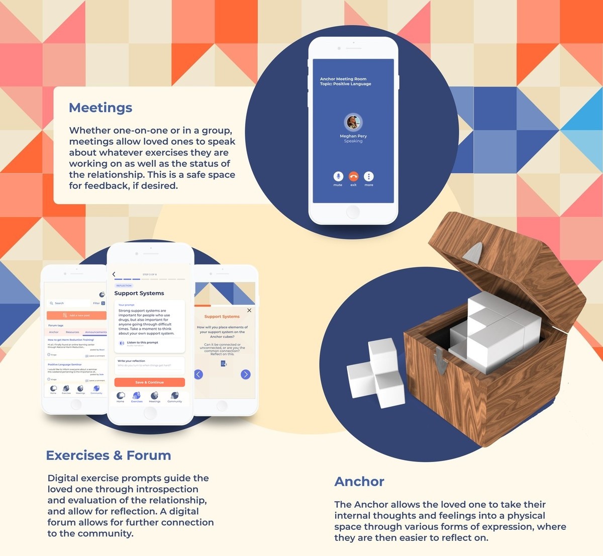
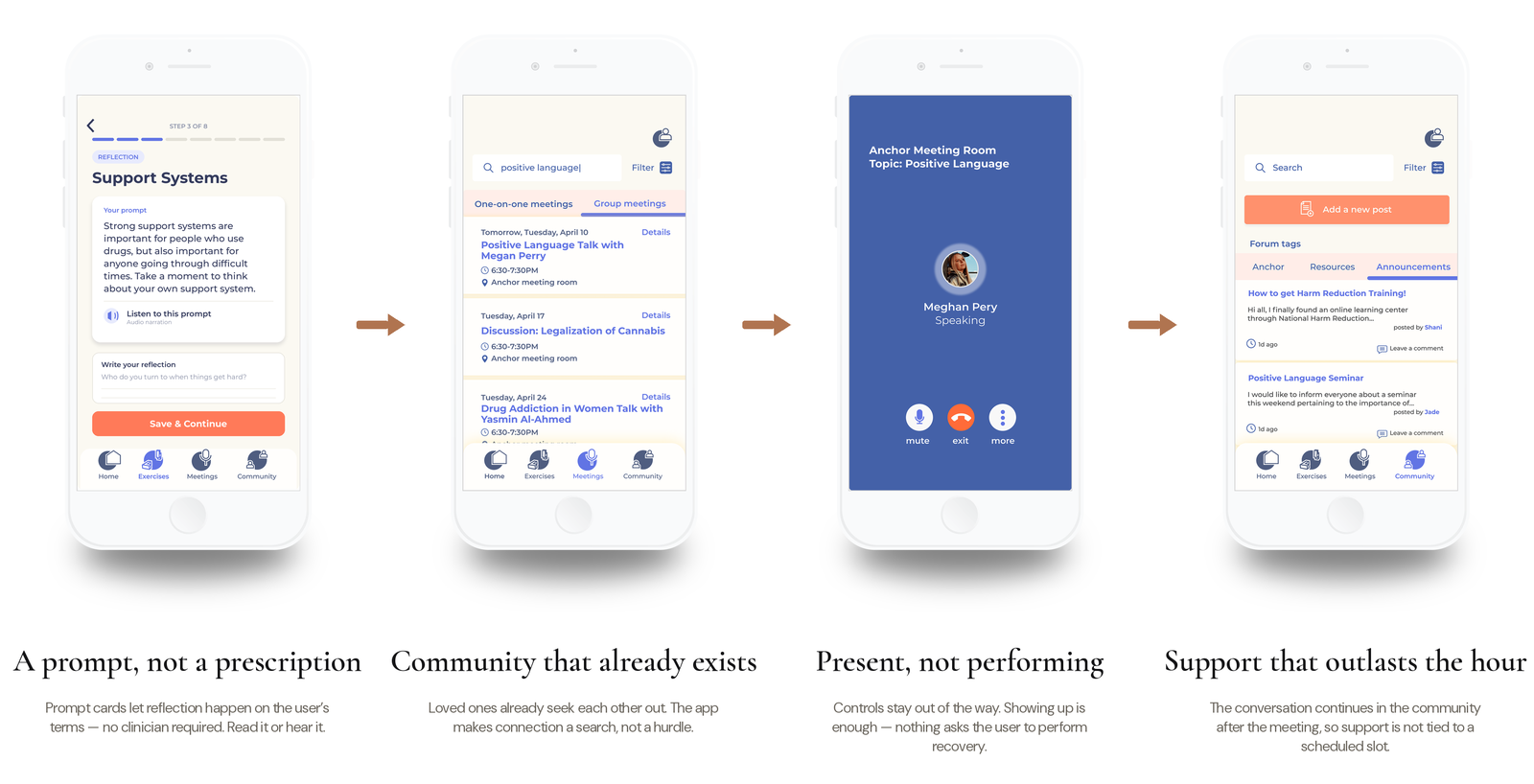
Anchoring Love became a harm-reduction alternative to twelve-step and Nar-Anon-style programs, built for the loved ones themselves. Art and narrative therapy sit at its center, aimed at building emotional intelligence and self-awareness rather than delivering advice. It runs across four connected parts: the Anchor, a physical object; an app of guided exercises and a community forum; one-on-one and group meetings; and the site that ties them together.
The Anchor
The Anchor is where the digital turns tangible. Its blocks are arranged, rearranged, decorated, and redecorated to mirror a relationship in constant flux, because breaking and building are both part of the process. It lets someone take an abstract internal state out of their head and into a physical space they can finally put words to.
The system at a glance
The app, four commitments
The meeting format needed to be facilitated with little to no prior knowledge of harm reduction or therapy, so four commitments carried the interface. A prompt, not a prescription, exercise cards guide reflection on someone's own terms, read or heard through audio narration, with no clinician required to begin. Community that already exists, loved ones already seek each other out, so the forum surfaces that community instead of asking people to build it from nothing. Present, not performing, in meetings the controls stay out of the way, showing up is enough. And support that outlasts the hour, conversation continues in the community after a meeting ends, so support isn't tied to a scheduled slot.
08 · Looking back
Success was never going to be a download count
The metrics that actually meant something were quieter than usage numbers: whether someone could have a more productive conversation with the person they loved, and whether they could open up and express themselves in a group setting at all. Everything in the system, the Anchor, the prompts, the meetings, was built to move those two numbers, not engagement.
Good design isn't always about clarity or efficiency. Sometimes it's about holding complexity without trying to resolve it for someone. This system didn't try to fix anyone's relationship. It gave people who had been carrying something alone a place to finally put it down, even briefly, and pick it back up with a little more language for what they were feeling.